Enter the access phrase to read the full study — or request it.
A shared dashboard for tracking policy compliance across the org — one view instead of scattered inbox alerts.
Led end-to-end design for an enterprise platform serving every Microsoft employee who owns a digital asset, driving alignment across global PM and engineering teams.
97% fewer alerts, and a rate that went up — both moved once the emails stopped being the only signal.
How this actually went.
I took over a project that had stalled. The design work came after the repair work.
Took over a stalled project mid-flight.
Inherited eng and PM relationships in worse shape than the work.
Settled what the hub had to answer before drawing anything.
New components, one language across the product.
One monthly digest, not one alert per violation.
Your own assets, sorted by what is due.
Copilot explains consequences and suggests owners. Not shipped yet.
Measured, then cut what reviewers didn't use.
Everyone got the emails. Nobody could see all of them.
Compliance ran on scattered inbox alerts. Three things kept it broken.
We read the inbox before we designed anything.
A month of compliance alerts, and the people on the receiving end of them. Three findings shaped the build.
Make the alert carry the answer.
People weren't going to stop getting emails, so the email had to stop arriving one asset at a time — a single monthly digest of everything you own, compliant and not, with one way in.
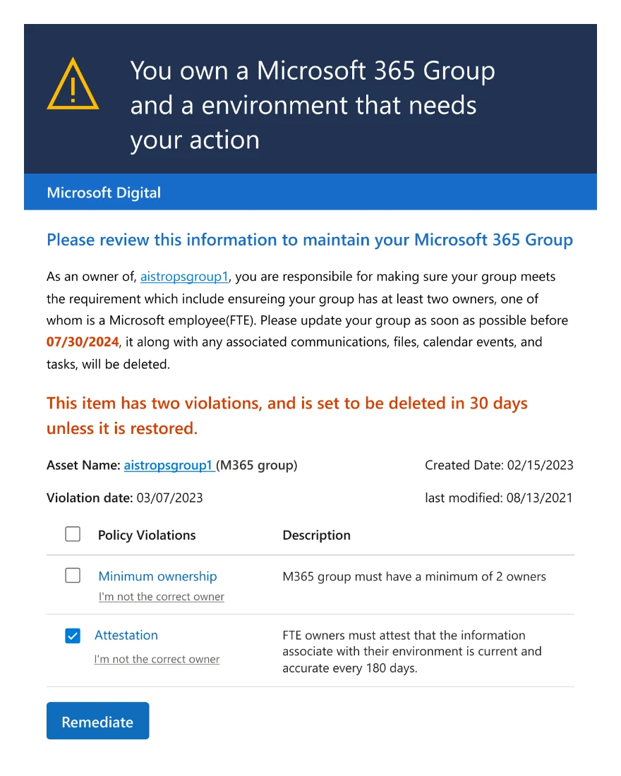
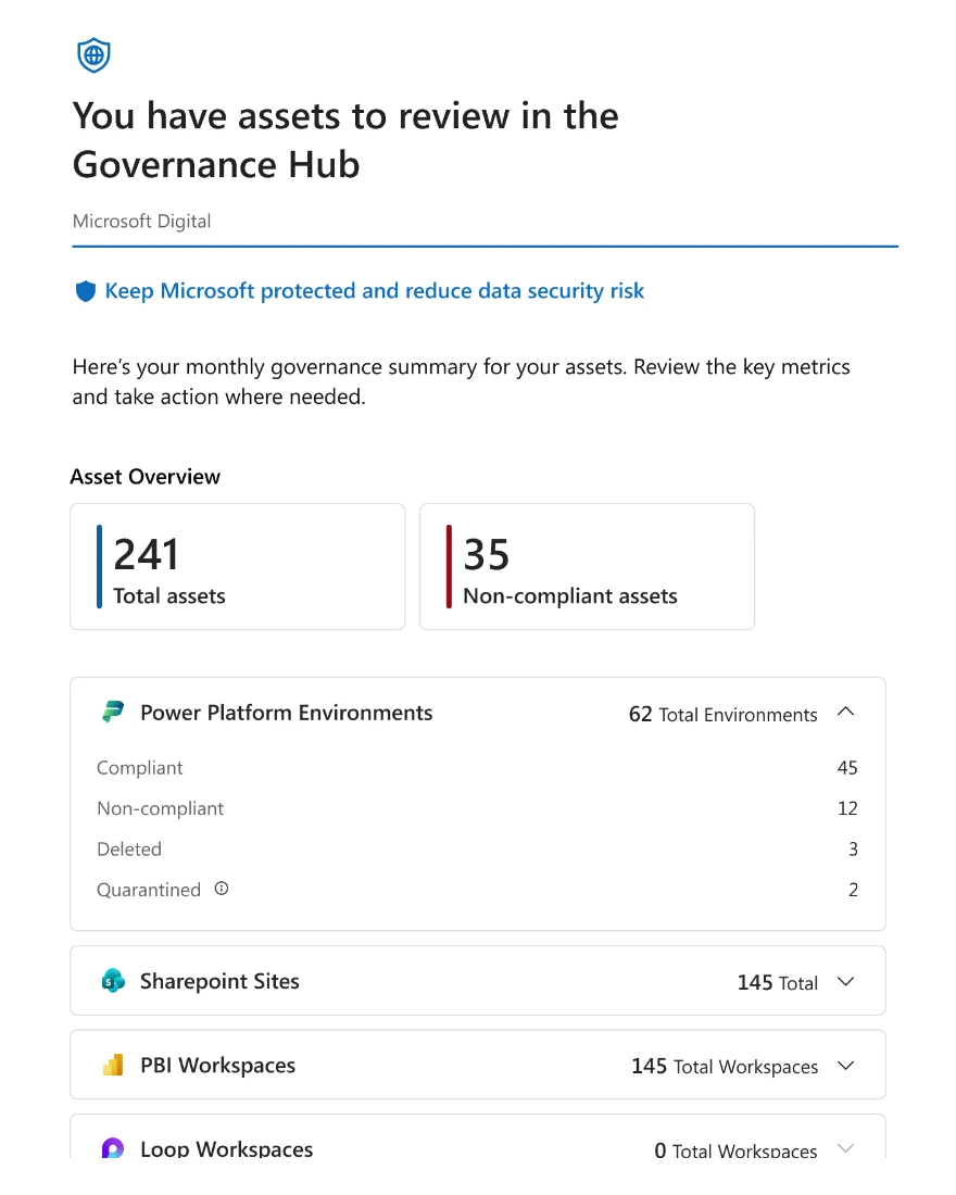
The digest shipped first, and it worked: 97% fewer alerts. It still couldn't tell you where you stood.
The research and the ask didn't agree.
Leadership wanted the single number they'd been assembling by hand. The people who actually close gaps needed the opposite: their own gaps, by name, with a next step. Those aren't the same view, and most of the design work was holding both without letting either win outright.
Deadlines first, owners on every row
A percentage is not something you can act on. So the hub opens on your own assets, sorted by what's due, and the rollup leadership asked for sits on top of that list rather than replacing it.
Sorting by policy type was the other option and it read cleanly, but it buried urgency two clicks down. A view that hides the thing you're behind on is a report, not a tool.
No automated nagging
The fastest way to move the rate was more pressure: escalate overdue items automatically, copy the manager, keep sending. I argued against it. Nobody was missing deadlines because they hadn't been told; they were missing them because nothing showed them where they stood. Adding volume to a channel people had already tuned out would have spent the last of the attention those alerts had.
One place that shows where you stand.
Every decision we made is visible on this one screen.
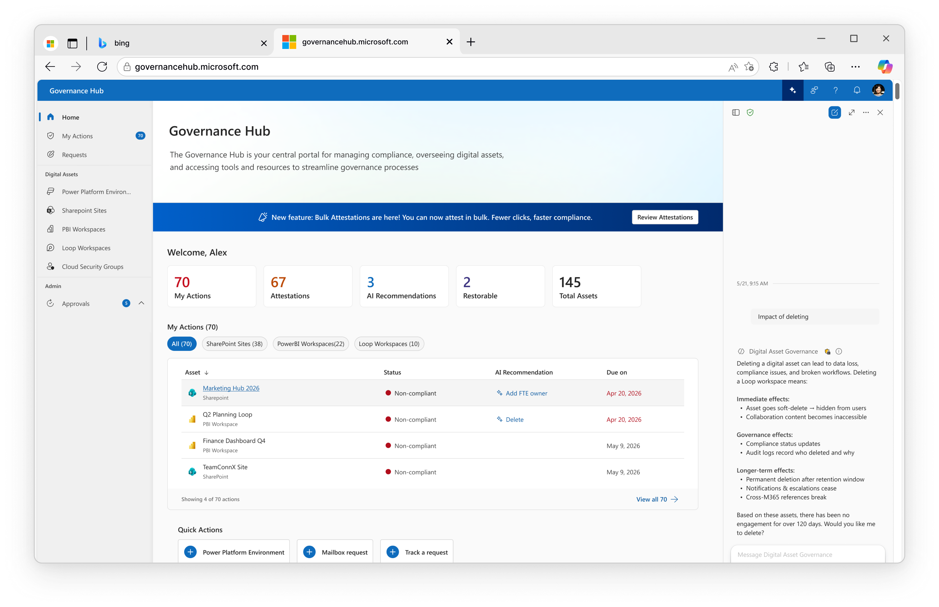
Alex sees his 145 assets, not the org’s.
Actions, attestations, recommendations and the total, in one row.
Deadlines drive the order, state sits beside it.
Add an owner or delete — suggested, never applied.
The assistant spells out what deleting breaks, before anyone confirms.
The asks people used to email, opened from the same screen.
The compliance rate didn't move because policy changed. It moved because people could finally see it.
Tracked before and after in the same compliance dashboard, org-wide.
What I'd change
The hub shows an owner where their own assets stand, but not why a gap is still open — you see red without seeing the blocker. A reason that travels with the gap is what I'd build next.