Enter the access phrase to read the full study — or request it.
A guided, agent-assisted workflow for publishing employee-built apps to the Microsoft catalog.
I owned the end-to-end design, built new components, rebuilt the ALM design system, and introduced AI into a manual process.
Fewer handoffs, fewer errors: one guided path replaced a dozen disconnected screens.
Where the time actually went.
Everyone assumed the tooling was slow. It wasn't, and that changed what I built.
Followed submissions end to end before touching a screen.
The days sat in the review queue, not the tooling.
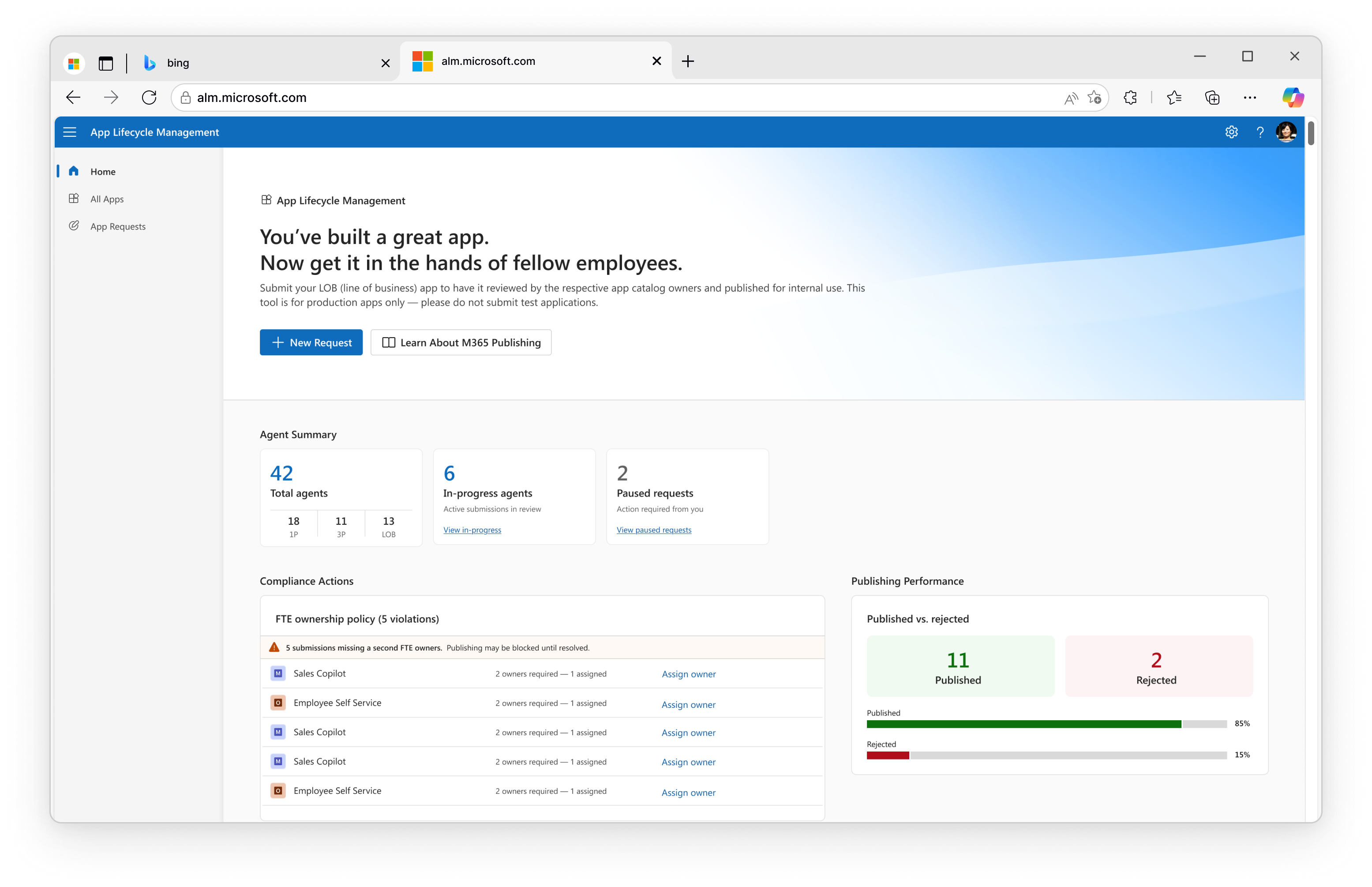
New components, one language across ALM.
A dozen disconnected screens became one guided path.
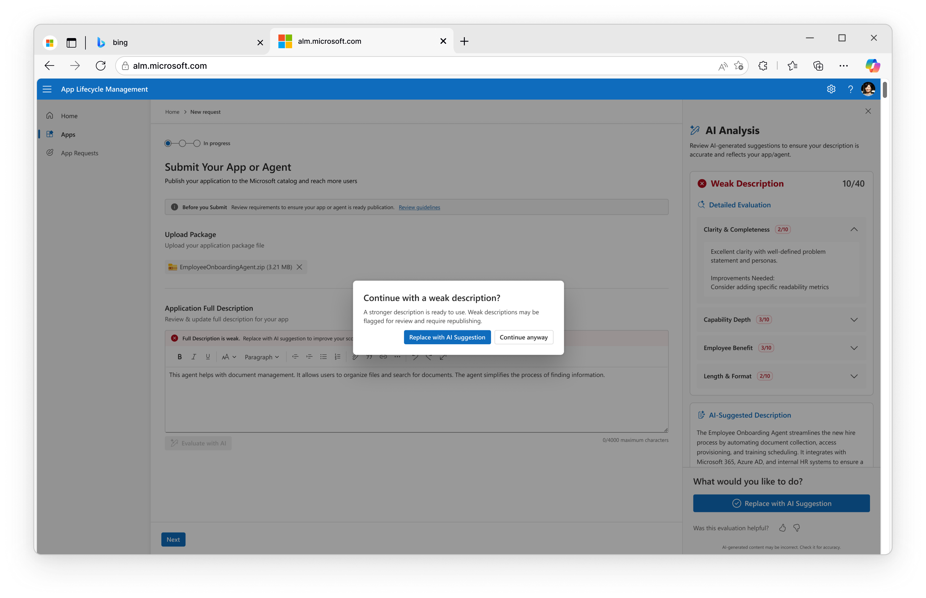
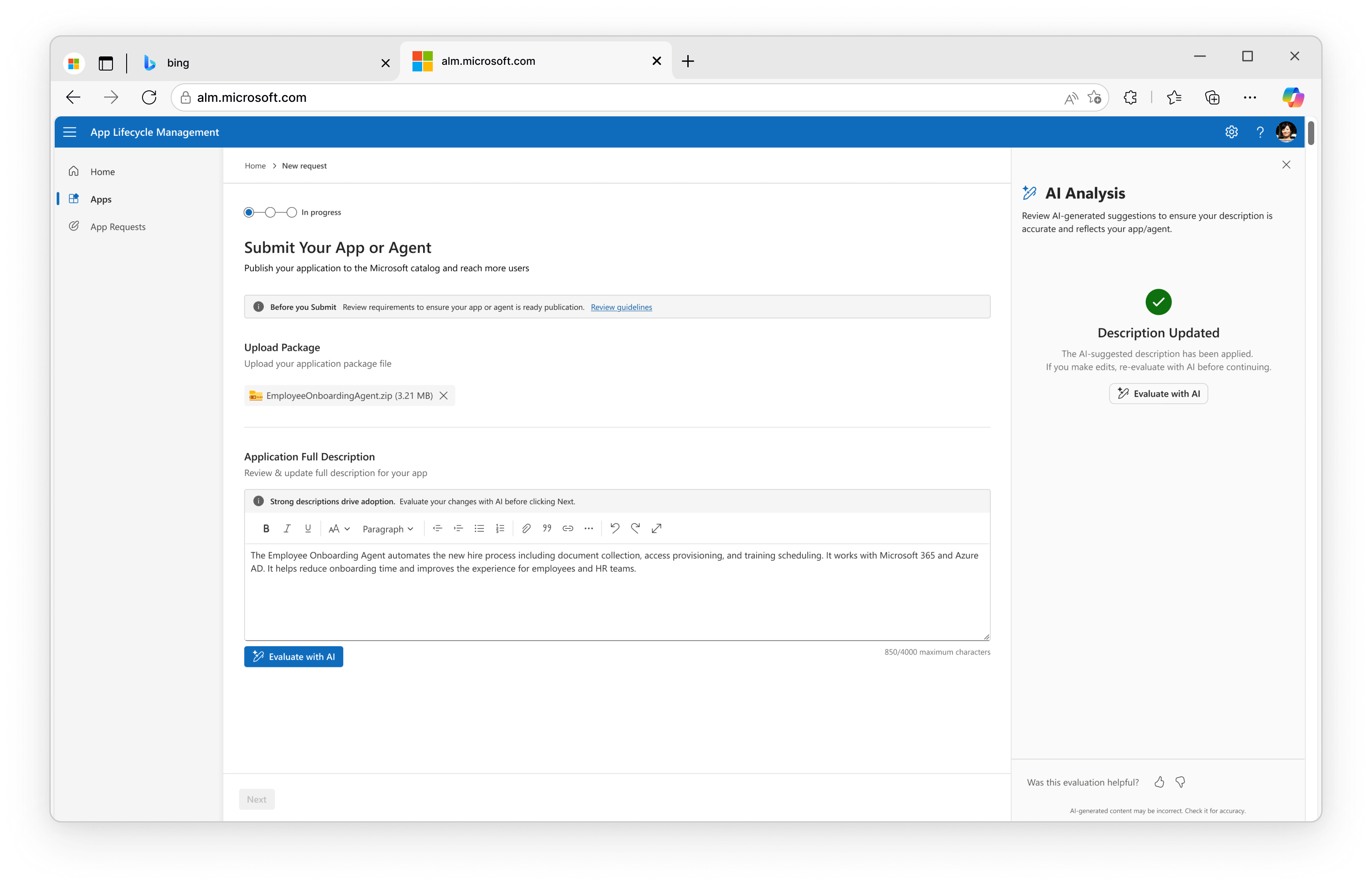
Weak descriptions get caught where they're written, not in review.
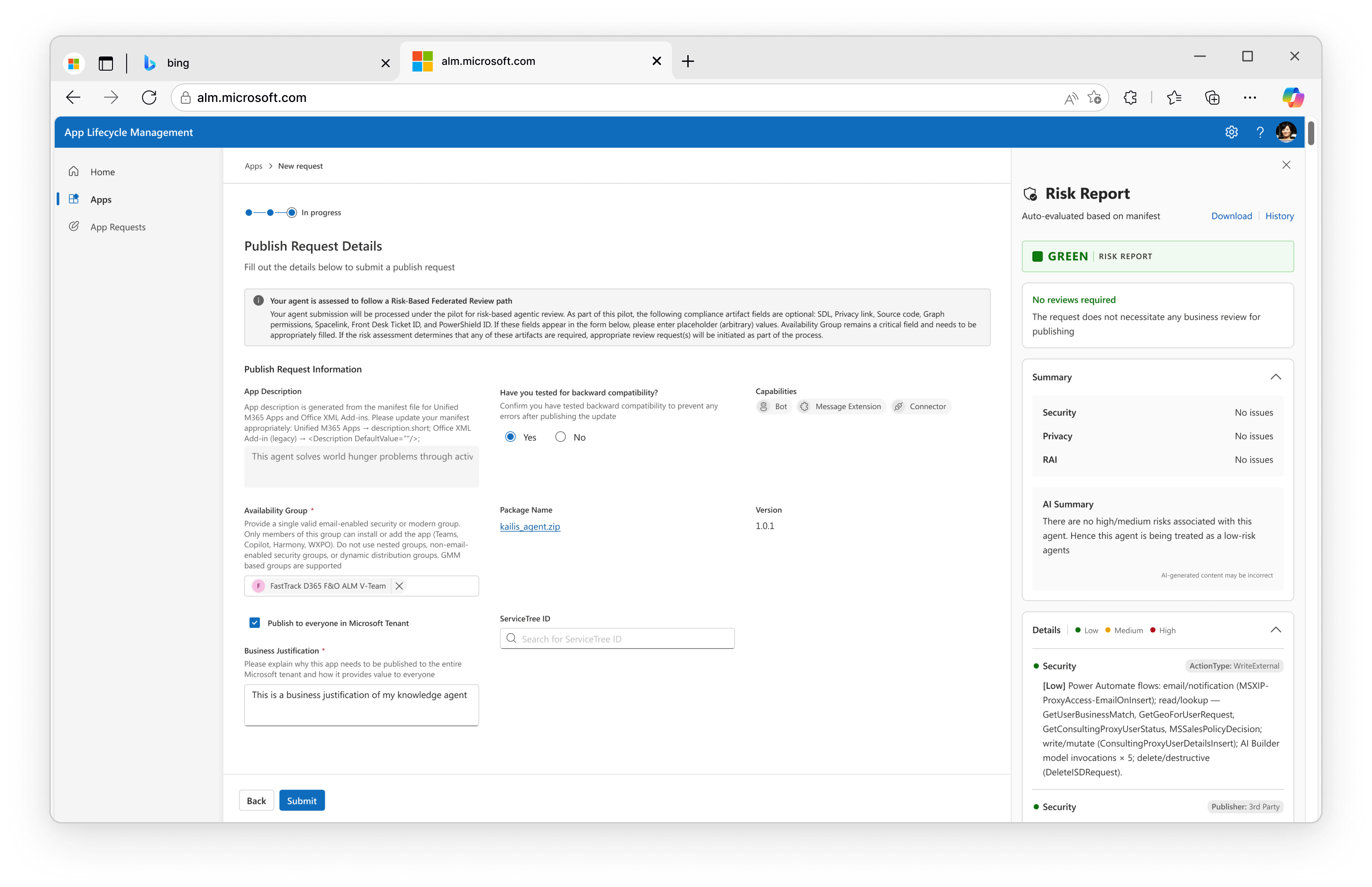
Risk read off the manifest picks the path — green shortens it, nobody skips it.
The agent prepares the package. A person still decides.
The product worked. It just took forever.
Managing an app's lifecycle meant hopping across a dozen disconnected screens. Three things kept biting.
We didn't guess at the bottleneck. We timed it.
Before touching a screen, we followed submissions end to end and recorded where the days actually went. All three pointed the same direction.
Most of the wait wasn't in the tooling.
A dozen screens is slow, and replacing them with one fast screen is the obvious fix. It would also have moved the wait rather than removed it, out of the tooling and into the queue, where most of it already sat.
So I stopped asking how to shorten the path and started asking how much of it a person needed to be in, which submissions belonged in it at all, and which parts they had to stay accountable for.
One guided path
An employee publishing an app doesn't know the sequence. They know the outcome they want. The old interface asked them to know both.
The alternative was a better dashboard: everything visible at once. I argued against it. A dashboard is faster for the handful who publish every week and close to useless for everyone else, and everyone else was most of the traffic. So the admin states the outcome and the agent lays out the sequence. Guided isn't the same as hidden: every step is on screen before it runs, and they can step out at any point.
A minimum bar, before the queue
A thin app description isn't a cosmetic problem. It gets flagged in review, sent back, rewritten and republished. One submission making the same trip twice. Fixing it after the fact was costing more queue time than the review it failed.
So the description is evaluated where it's written, not where it's read. A weak one comes back broken out by clarity and completeness, next to a rewrite the submitter can take, edit or ignore — and they can still submit as-is. That dialog was the one I argued hardest for, because it names the cost instead of blocking the action. Most people fix it once they know it'll cost them a second trip.
The Risk-o-meter
Review was the queue, and the queue had no order to it. A form-filling utility built by one team waited behind an app requesting broad tenant permissions, and both got read with the same care.
Risk used to be whatever the submitter declared. Now the system reads it off the manifest — what the app can reach, write to and touch — and returns green, yellow or red. The color picks the review path, not the decision. It also has to be readable: if a reviewer can't see what's behind a rating, they can't argue with it, and they stop checking it. So every color opens into its signals, and a reviewer can override it either way, recorded against the assessment rather than the app. The override started as a safety valve and turned out to be the thing that kept reviewers reading.
AI-assisted review
Evaluation runs in parallel with the upload rather than after it, so by the time a submission reaches a reviewer the checks are done and the summary is drafted. Their first minute goes to the decision, not to the setup for it.
The decisions stay with separate reviewers, each owning their own call on the same prepared package: the agent writes the summary, and each reviewer approves, rejects or pauses within their own remit. The hardest argument on the project was whether the agent should go further and approve green submissions outright. I held that it prepares the material and a person decides, so someone who wasn't in the room can still see who decided what, and why.
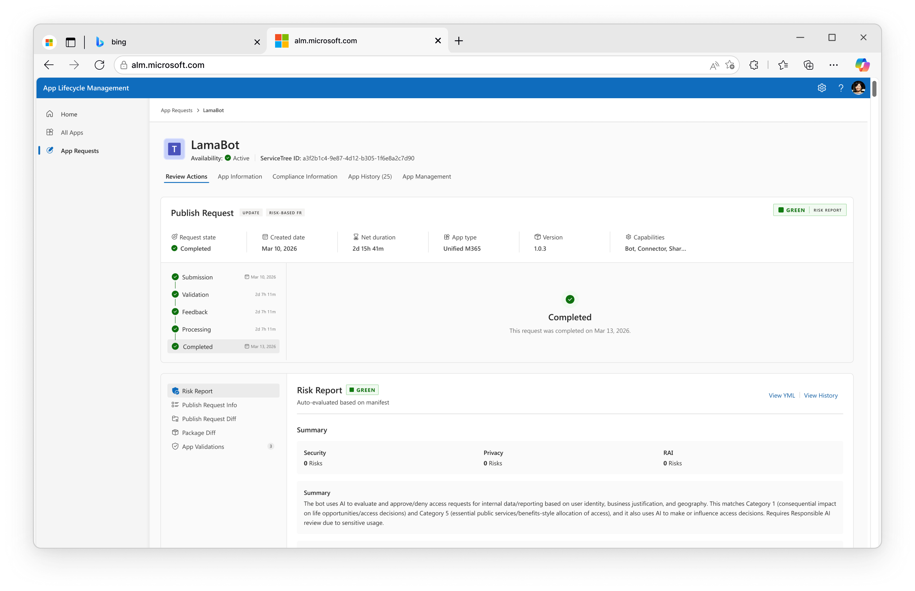
The fastest way to speed people up wasn't a slicker screen — it was letting AI carry the steps that never needed a human.
What held
The guided path shipped as the default, and the override has stayed in use. That's the number I watch — it means reviewers are still reading.
What I'd change
Business Review runs Security, Privacy and RAI at once, but none of them can see what the others are looking at. I gave them parallel review without a shared view. That's what I'd build next.
The description evaluation and the risk read also never compare notes, so a description promising what the manifest doesn't grant only surfaces when review sends it back. Catching that at submission would save the same trip the description check already saves.